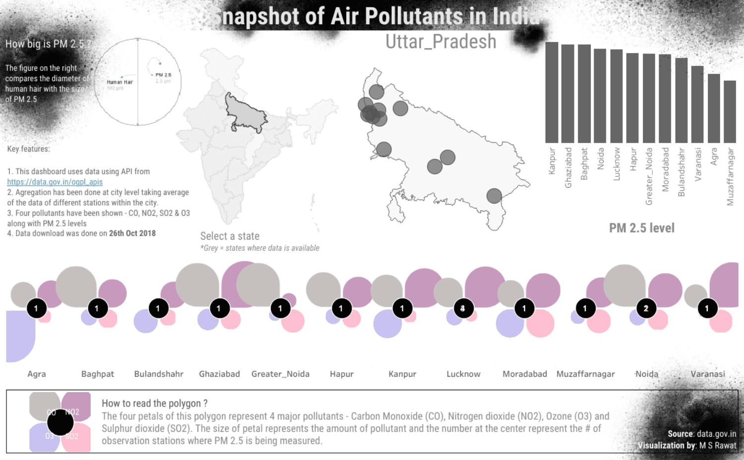
The Breakthrough We created a visual language for invisible danger. Innovative petal polygons display four major pollutants simultaneously, making it instantly clear when Kanpur's air becomes hazardous. The human hair comparison for PM 2.5 particles turns abstract measurements into visceral understanding—these particles are 30 times smaller than what you can see.
Engineering Excellence: Geospatial station mapping combined with real-time pollutant overlay, using comparative scaling to make environmental data accessible to non-technical stakeholders and drive public health interventions.
About author
Manvirender is a data enthusiast and founder at Klaymatrix Data Labs

Manvirender Singh Rawat
Head of Strategy
Get AI & data insights — straight to your inbox
Sign up to get the most recent blog articles in your email every week.